Introduction
Kerry Kolosko created an excellent article about the embedding of HTML content into Power BI. All sorts of content can be embedded within HTML Content custom visual, but the most interesting are Google Charts and Vega-Lite. Both of these visualization libraries offer a rich gallery of interactive charts that can extend the functionality of Power BI. However, there is a problem - the content of the visualizations is static. Ideally, you would want to use the data that’s already loaded into Power BI, and any changes to filters/slicers should also be reflected in the visualizations powered by Google Charts and Vega-Lite. I will focus on Google Charts in this tutorial, but the same trick should also work for Vega-Lite.
PBIX file
Preparation
Import HTML Content custom visual. ( HTML Content (lite) won’t work, because it doesn’t permit loading from external URLs )
Static embedding
HTML code can be placed into a measure in Power BI by enclosing it in double qoutes ("):
Timeline =
"<html>
   <head>
      <script type='text/javascript' src='https://www.gstatic.com/charts/loader.js'></script>
      <script type='text/javascript'>
         google.charts.load('current', {'packages':['timeline']});
         google.charts.setOnLoadCallback(drawChart);

         function drawChart() {
           var data = new google.visualization.DataTable();
           data.addColumn({ type: 'string', id:'Row Label'});
           data.addColumn({ type: 'string', id:'Bar Label'});
           data.addColumn({ type: 'string', role: 'style' });
           data.addColumn({ type: 'date', id:'Start Date'});
           data.addColumn({ type: 'date', id:'End Date'});

         data.addRows([
           ['M01', 'J023', '#9A64A0', new Date(2023,3,18,11,40), new Date(2023,3,18,13,18)],
           ['M01', 'J056', '#9A64A0', new Date(2023,3,18,17,10), new Date(2023,3,18,18,54)],
           ['M01', 'J082', '#9A64A0', new Date(2023,3,18,21,30), new Date(2023,3,18,21,54)],
           ['M01', 'J010', '#9A64A0', new Date(2023,3,18,9,30), new Date(2023,3,18,9,57)]
         ]);

           var options = {
             timeline: {
                 rowLabelStyle: { fontSize: 12 },
                 barLabelStyle: { fontSize: 8 }
             },
             height: 610
           };

           var chart = new google.visualization.Timeline(document.getElementById('chart_div'));

           chart.draw(data, options);
         }
      </script>
   </head>
   <body>
      <div id='chart_div'></div>
   </body>
</html>"
Dynamic embedding
We need to calculate the rows of data with a separate measure:
Timeline =
"<html>
   <head>
      <script type='text/javascript' src='https://www.gstatic.com/charts/loader.js'></script>
      <script type='text/javascript'>
         google.charts.load('current', {'packages':['timeline']});
         google.charts.setOnLoadCallback(drawChart);

         function drawChart() {
           var data = new google.visualization.DataTable();
           data.addColumn({ type: 'string', id:'Row Label'});
           data.addColumn({ type: 'string', id:'Bar Label'});
           data.addColumn({ type: 'string', role: 'style' });
           data.addColumn({ type: 'date', id:'Start Date'});
           data.addColumn({ type: 'date', id:'End Date'});

         data.addRows(["& [dataTable] &"]);

           var options = {
             timeline: {
                 rowLabelStyle: { fontSize: 12 },
                 barLabelStyle: { fontSize: 8 }
             },
             height: 610
           };

           var chart = new google.visualization.Timeline(document.getElementById('chart_div'));

           chart.draw(data, options);
         }
      </script>
   </head>
   <body>
      <div id='chart_div'></div>
   </body>
</html>"
In order to calculate the data rows, we need to utilize CONCATENATEX function:
dataTable =
CONCATENATEX(
    SELECTCOLUMNS(
        Manufacturing,
        Manufacturing[Machine_ID],
        Manufacturing[Job_ID],
        Manufacturing[Operation_Type],
        "Start", Manufacturing[Scheduled_Start],
        "End", Manufacturing[Scheduled_End]
    ),
    "['" &
    [Machine_ID] & "', '" &
    [Job_ID] & "', '" &
    SWITCH(
        [Operation_Type],
        "Additive" , "#4A8DDC",
        "Drilling" , "#9A64A0",
        "Grinding" , "#33AE81",
        "Lathe"    , "#DC5B57",
        "Milling"  , "#FFA500",
        "#000000"
    ) & "', " &
    "new Date(" & YEAR([Start]) &","& MONTH([Start]) &","& DAY([Start]) &","& HOUR([Start]) &","& MINUTE([Start]) &"), "&
    "new Date(" & YEAR([End]) &","& MONTH([End]) &","& DAY([End]) &","& HOUR([End]) &","& MINUTE([End]) &")"&
    "]",
    ",",
    [Machine_ID],
    ASC
)
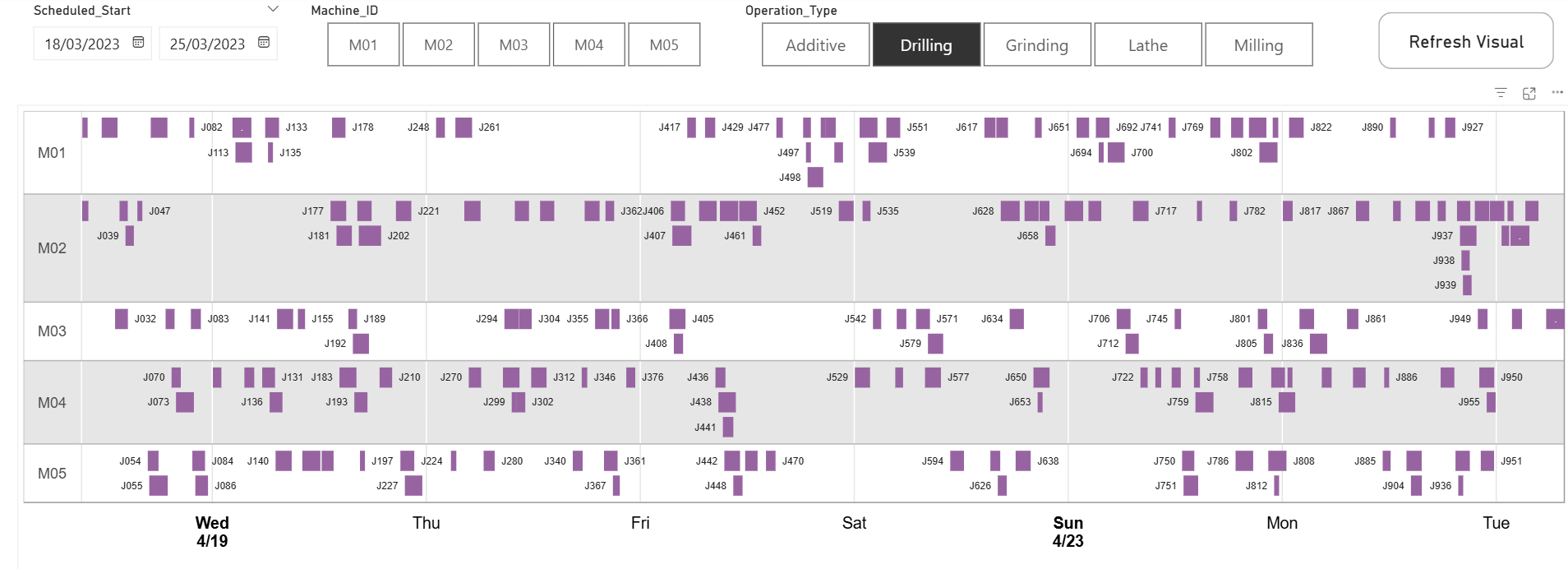
Now, it’s possible to use slicers and filters on your data:
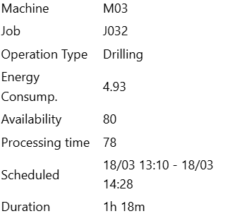
HTML tooltip
The default tooltip only shows limited information, but it is possible to construct a tooltip from HTML, which allows you to display more data fields. Based on the documentation about Google Charts, you can also embed a mini Google Charts graph within the tooltip. In order to enable HTML tooltips, some settings need to be adjusted in the code:
Timeline_HTML_tooltip =
"<html>
   <head>
      <script type='text/javascript' src='https://www.gstatic.com/charts/loader.js'></script>
      <script type='text/javascript'>
         google.charts.load('current', {'packages':['timeline']});
         google.charts.setOnLoadCallback(drawChart);

         function drawChart() {
           var data = new google.visualization.DataTable();
           data.addColumn({ type: 'string', id:'Row Label'});
           data.addColumn({ type: 'string', id:'Bar Label'});
           data.addColumn({ type: 'string', role: 'tooltip', p: { html: true } });
           data.addColumn({ type: 'string', role: 'style' });
           data.addColumn({ type: 'date', id:'Start Date'});
           data.addColumn({ type: 'date', id:'End Date'});

         data.addRows(["& [dataTable_HTML_tooltip] &"]);

           var options = {
             tooltip: { isHtml: true },
             timeline: {
                 rowLabelStyle: { fontSize: 12 },
                 barLabelStyle: { fontSize: 8 }
             },
             height: 610
           };

           var chart = new google.visualization.Timeline(document.getElementById('chart_div'));

           chart.draw(data, options);
         }
      </script>
   </head>
   <body>
      <div id='chart_div'></div>
   </body>
</html>"
When the HTML is changed to accomodate the new tooltip, the tooltip section can be added to the measure that assembles the dataTable:
dataTable_HTML_tooltip =
CONCATENATEX(
    ADDCOLUMNS(
        SELECTCOLUMNS(
            Manufacturing,
            Manufacturing[Machine_ID],
            Manufacturing[Job_ID],
            Manufacturing[Operation_Type],
            Manufacturing[Energy_Consumption],
            Manufacturing[Machine_Availability],
            Manufacturing[Processing_Time],
            "Start", Manufacturing[Scheduled_Start],
            "End", Manufacturing[Scheduled_End],
            Manufacturing[Duration]
        ),
        "Scheduled", FORMAT([Start], "dd/MM hh:mm") &" - "& FORMAT([End], "dd/MM hh:mm")
    ),
    "['" &
    [Machine_ID] & "', '" &
    [Job_ID] & "', '" &
    /**********************************    HTML   **********************************/
    "<table>" &
        "<tr><td>Machine</td> <td>" & [Machine_ID] & "</td></tr>" &
        "<tr><td>Job</td> <td>" & [Job_ID] & "</td></tr>" &
        "<tr><td>Operation Type</td> <td>" & [Operation_Type] & "</td></tr>" &
        "<tr><td>Energy Consump.</td> <td>" & [Energy_Consumption] & "</td></tr>" &
        "<tr><td>Availability</td> <td>" & [Machine_Availability] & "</td></tr>" &
        "<tr><td>Processing time</td> <td>" & [Processing_Time] & "</td></tr>" &
        "<tr><td>Scheduled</td> <td>" & [Scheduled] & "</td></tr>" &
        "<tr><td>Duration</td> <td>" & [Duration] & "</td></tr>" &
    "</table>"
    /**********************************    HTML   **********************************/
    & "', '" &
    SWITCH(
        [Operation_Type],
        "Additive" , "#4A8DDC",
        "Drilling" , "#9A64A0",
        "Grinding" , "#33AE81",
        "Lathe"    , "#DC5B57",
        "Milling"  , "#FFA500",
        "#000000"
    ) & "', " &
    "new Date(" & YEAR([Start]) &","& MONTH([Start]) &","& DAY([Start]) &","& HOUR([Start]) &","& MINUTE([Start]) &"), "&
    "new Date(" & YEAR([End]) &","& MONTH([End]) &","& DAY([End]) &","& HOUR([End]) &","& MINUTE([End]) &")"&
    "]",
    ",",
    [Machine_ID],
    ASC
)
It’s best to add some CSS to the HTML Content visual under Formatting -> Stylesheet:
table {
  margin: 5px;
  border-collapse: collapse;
  white-space: nowrap;
}

table td:first-child {
  padding-right: 5px;
  font-weight: bold;
  color: #333;
}
The CSS adjusts the word wrap and font-weight:
Important considerations/limitations
- The method described above allows you to modify the contents of a
Google Chartusing slicers or filters. However, it is important to remember that a selection made inHTML Contentcustom visual cannot cross-highlight or filter other visuals in Power BI. - When switching from one page to another, the
HTML Contentcustom visual might appear empty. The custom visual can berefreshedif you interact with the report page, which is why I decided to add a dedicated slicer to the report in a form of a button -Refresh Visual.
Credits
- Kerry Kolosko - Embedding Charts from Web (blog article)
- Google Charts - Google Charts (documentation for developers)